In short
- —Marketplace had been designed for a handful of offerings. By 2025, it held 15–20 investments across five product types, still presented in roughly the same hierarchy.
- —As Investments and Product Marketing converged around a Core / Satellite strategy, I used design to make that strategy tangible and help move a long-running conversation forward.
- —User research showed investors using offering pages to compare products, pushing the design from cards toward denser tables.
- —The redesign shipped with stronger navigation and category comprehension, while personalization remains the larger problem ahead.
Context
The old Marketplace wasn't broken, but the product around it had changed.
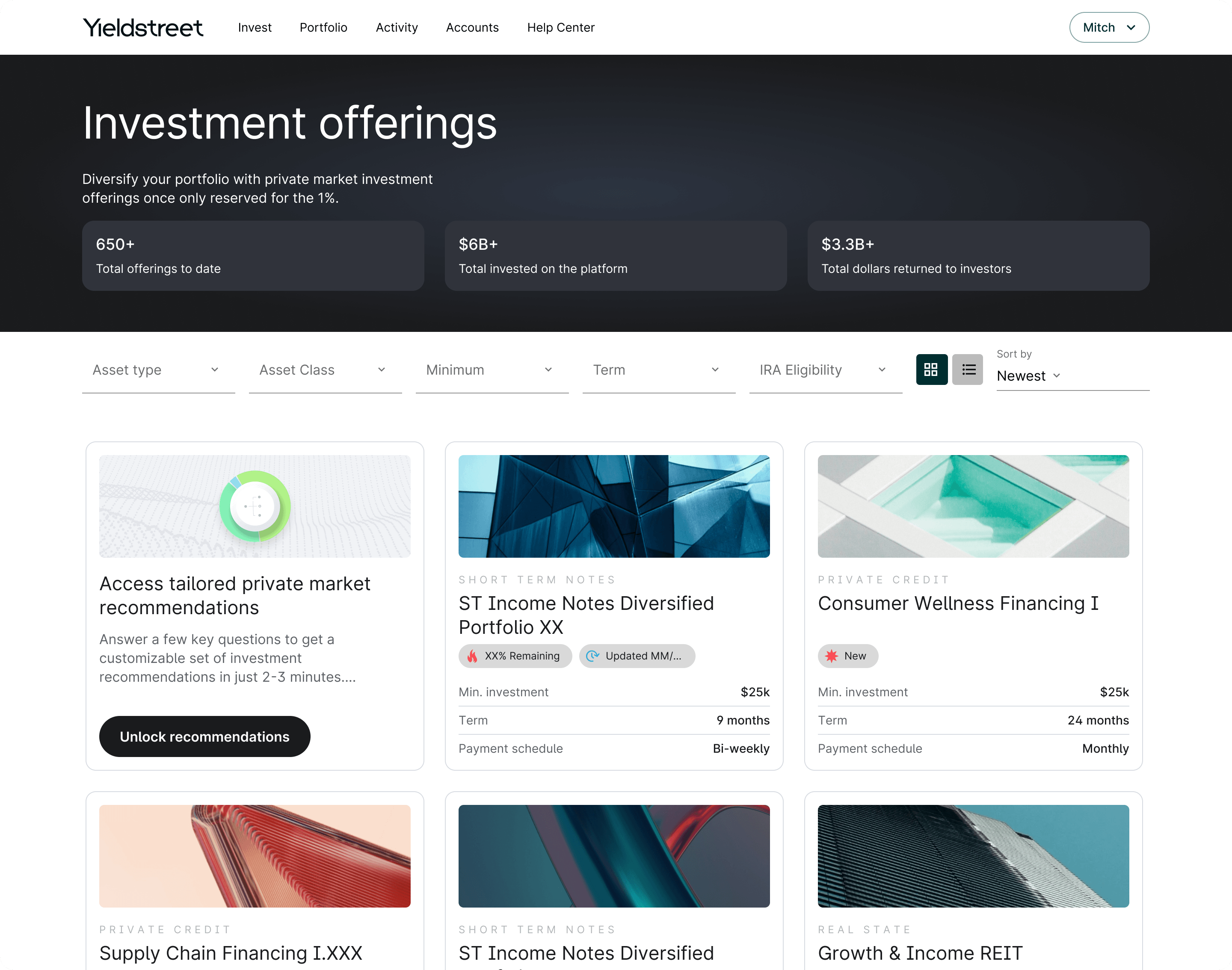
Willow Wealth’s Marketplace was designed when there were only a few live investments, most of which behaved similarly from an investor’s point of view. Large cards with custom imagery made sense: each opportunity could feel substantial, and scarcity was part of the experience.
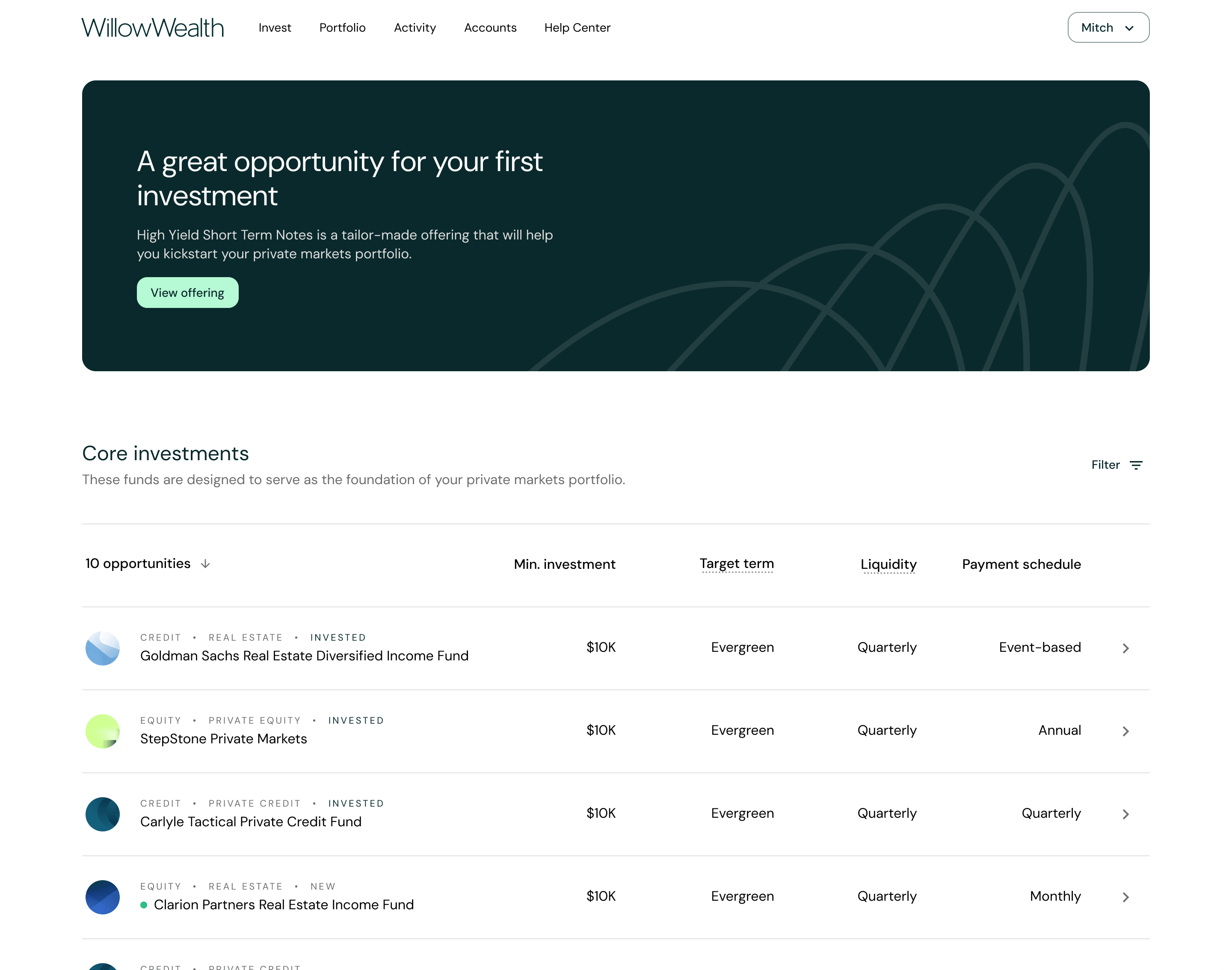
By 2025, Marketplace could contain 15–20 investments at once, including registered funds, SPVs, BPDNs, Short Term Notes and managed portfolios. These differed in liquidity, eligibility, mechanics and the role they were expected to play in a portfolio, but Marketplace still presented them in roughly the same hierarchy.
The original treatment gave every offering the same weight.
The business strategy was changing too. Product Marketing and Investments were converging around Core, Satellite and Liquidity Management: diversified funds and managed portfolios as a foundation, more concentrated private-market opportunities as satellite investments, and Short Term Notes as a separate liquidity-management category.
The foundation
Core
Diversified base exposure, primarily through registered funds and managed products.
Concentrated bets
Satellite
Individual, riskier private-market opportunities taken deliberately.
Cash management
Liquidity
Short-duration holdings kept separate from long-term allocation entirely.
The company had been revisiting how it talked about these products for years, but the conversations often stalled before turning into something concrete. I saw an opportunity to help unblock them by showing what this new investment strategy could actually look like in the product.
What needed to change
- 01
Product hierarchy
Registered funds and SPVs appeared side by side with nearly identical treatment, despite representing very different investment decisions.
- 02
Scale
As the catalog grew, large cards with images became harder to scan and created unnecessary visual-design overhead for every new offering.
- 03
Merchandising
The team wanted to group products by portfolio role, emphasize selected investments, and feature individual offerings. Marketplace supported none of it.
- 04
Ways to compare
Different product types relied on different metrics, but the flat hierarchy made comparison difficult at a glance.
First concept
Marketplace as an editorial surface
I began exploring the redesign before it became a formal project, using the work to bring several ongoing conversations about investment strategy, merchandising and product structure into one interface. This phase of the project took roughly 2 months.
The first direction was influenced by interfaces with editorial patterns such as Globoplay and Apple Store. Instead of one fixed grid, Marketplace could organize investments into sections such as For You, Core Investments, Satellite Investments and Liquidity Management, while giving Product Marketing control over featured offerings and page hierarchy.
The For You section drew inspiration from the personalized discovery patterns of platforms like Netflix.
The first Marketplace concept brought curated rows into the experience, opening space for both editorial control and personalization. The goal was to recommend investments more intelligently while making the reasoning behind those recommendations easier for users to understand.
In the first concept, the card design was simplified to reduce its reliance on custom imagery from the Marketing team.
This concept did not become the final interface, but it made the strategy tangible enough for Product Marketing, Investments, Product and leadership to evaluate together. From there, the exploration became a formal redesign project.
The decision
From cards to tables
After about a year of debating and strategy work within Marketing and Investments teams, the project was formally picked up. From there I led the design effort, being the sole designer, with a product manager and four developers.
The original direction used horizontal rows of cards but, while exploring FullStory recordings, we discovered a significant amount of users who opened multiple investments only to view certain specific metrics related to the investments. That pushed the design toward tables on desktop, and simpler lists on mobile.
With tables
Higher information density makes investments easier to scan and compare.
With cards
More flexibility to editorialize and personalize the experience, while using card patterns as visual assets that could be reproduced more easily across the platform.
The final structure kept the Core, Satellite and Liquidity Management categories while presenting investments in a denser, more consistent format. Users could scan several offerings and their attributes together instead of treating each one as an isolated card.
The table format was less visually expressive, but better suited to a larger catalog and to investors trying to make distinctions between similar-looking financial products. It also reduced the reliance on custom imagery, which could remain more prominent on individual offering pages.
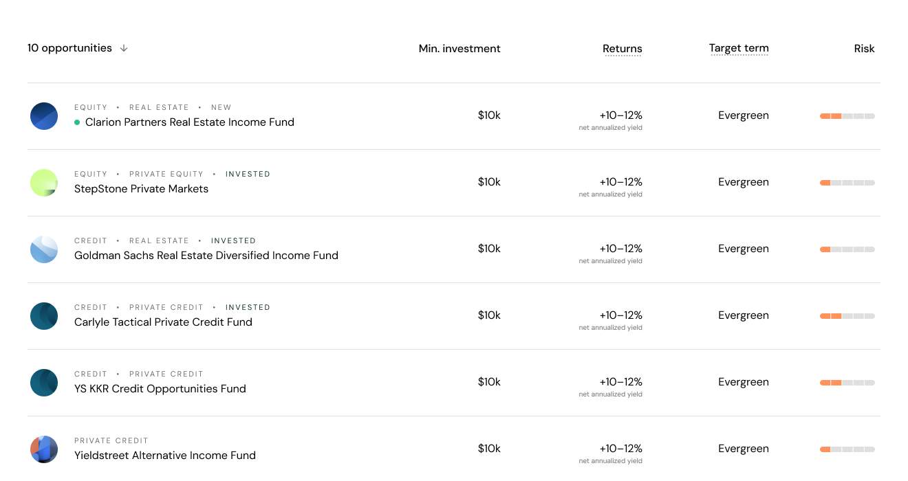
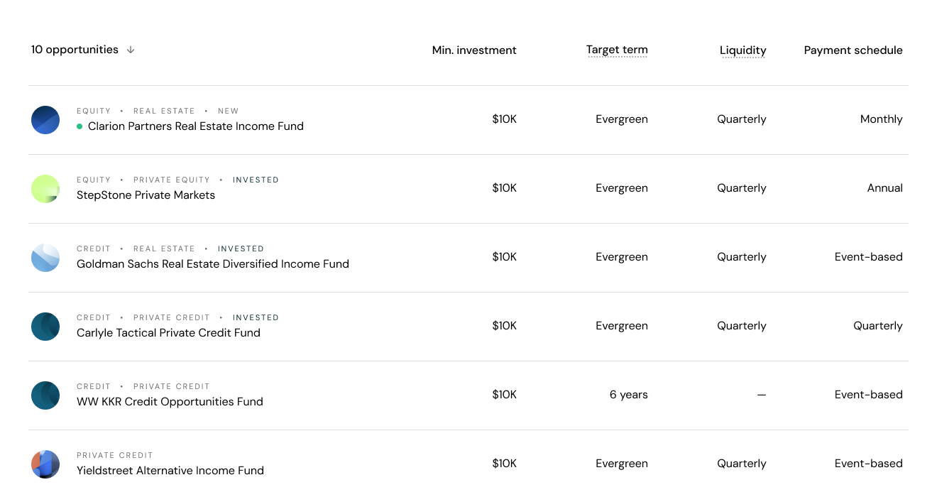
Returns and risk were among the metrics users cared about most. Regulatory constraints, however, meant we had to ship with a more limited view of both.
I also explored exposing attributes such as target return and a clearer indication of risk, but regulatory and product-policy constraints limited what could be shown directly in Marketplace. Post-launch feedback later reinforced that gap, with some investors explicitly asking for return or yield information in the summary.
Outcome
What shipped, and what didn't
The project took roughly 2-3 months to be completed.
The production Marketplace introduced the new investment categories with more compact table treatment and greater editorial control for Product Marketing.
A deeper Marketplace layer was also introduced, allowing users to browse and filter the full investment catalog. Designed for more sophisticated investors, it also serves Marketing, Support, and PCG teams, who can generate filtered links to share specific investment opportunities in campaigns and client conversations.
The For You concept, which was designed to bring broader personalization into the portfolio experience, had to be cut from scope. The main constraint wasn’t the interface; meaningful personalization requires reliable data, recommendation logic and enough confidence in the output to make those recommendations appropriate in a financial context.
Hero banners powered by Braze content cards
As the direction moved away from the Netflix/Apple Store approach, the Marketplace lost some of its editorial character. I introduced hero banners powered by Braze Content Cards to restore that flexibility, giving Product Marketing more control over how new and strategically important offerings were promoted.
Results
Post-launch research was positive on the two things the redesign was actually trying to fix: navigation and category comprehension.
81%
Rated ease of navigation 4 or 5 out of 5
n=93 existing clients · mean 4.2 / 5
69%
Rated the redesign favorably against the previous Marketplace
n=93 existing clients
77%
Felt confident they could find a first investment
n=14 new signups · small sample
The same 14 new signups rated ease of exploring offerings and clarity of the investment categories at 77% positive. Fourteen respondents is directional, not conclusive.
The new signups rated ease of exploration and confidence in finding a first investment at 77% too. Several respondents asked for return or yield in the summary view — the gap regulatory constraints had already forced.
Marketplace now matches Willow Wealth's investment strategy and handles a growing catalog. The next problem is harder: moving from organizing investments well to knowing which ones matter to each investor.